


Hello
everyone, in this blog post I'm going to tell you about a very cool
thing that you can do with HTML,CSS animations. So lets see how it is
done step by step.


1.Write the HTML
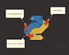
First we need to write the HTML for out postcard. Each postcard is composed of a postcard-front and postcard-back <div>, which contain the front and back images. there are wrapped in an outer div with the class "postcard". this lets us target each face individually, as well as the entire postcard. Make sure your front and back images are the same size for the effect to work properly.
2. Set the CSS
Next, we absolutely position the front and back postcard divs and relatively postion the postcard container. This allows the front and back faces to overlay each other instead of following the flow of the document. Note the width and height of the container is being set to the size of the images here:
3. Hide the backs
The next step is to set the backface-visibility of the faces. This means that when they are rotated, the backs of each image will be hidden. By default, we would see a mirrored version of the front face. we also set up a CSS transition for initial state of the back image to be rotated 180 degrees on the y axis:
4. Add the interactivity
Modernizr (modernizr.com) a feature detection tool, is used to see if the browser supports CSS transitions and 3D transforms, if it does support it, the csstransforms3d and css transitions classes will be added to the HTML element. This css then rotate the front and back faces when the user hovers over the post card container. The transition property we have already applied with animate the property.
5. Supporting old browsers

1.Write the HTML
First we need to write the HTML for out postcard. Each postcard is composed of a postcard-front and postcard-back <div>, which contain the front and back images. there are wrapped in an outer div with the class "postcard". this lets us target each face individually, as well as the entire postcard. Make sure your front and back images are the same size for the effect to work properly.
1 2 3 4 5 6 7 8 9 10 11 12 13 14 15 16 17 18 | <!DOCTYPE html> <html lang="en"> <head> <meta charset="utf-8" /> <title>HTML5</title> </head> <body> <div class="postcard"> <div class="postcard-back"> <img src="images/postcard-back.jpg" /> </div> <div class="postcard-front"> <img src="images/postcard-front.jpg" /> </div> </div> </body> </html> |
2. Set the CSS
Next, we absolutely position the front and back postcard divs and relatively postion the postcard container. This allows the front and back faces to overlay each other instead of following the flow of the document. Note the width and height of the container is being set to the size of the images here:
1 2 3 4 5 6 7 8 9 10 | .postcard { position: relative; margin: 0 auto; width: 400px; height: 270px; } .postcard-front,.postcard-back { position: absolute; } |
3. Hide the backs
The next step is to set the backface-visibility of the faces. This means that when they are rotated, the backs of each image will be hidden. By default, we would see a mirrored version of the front face. we also set up a CSS transition for initial state of the back image to be rotated 180 degrees on the y axis:
1 2 3 4 5 6 7 8 9 10 11 12 13 14 15 16 17 18 19 20 | .postcard { position: relative; margin: 0 auto; width: auto; height: auto; } .postcard-back { position: absolute; transform: rotateY(180deg); backface-visibility: hidden; transition: transform 1s ease-in-out; } .postcard-front { position: absolute; transform: rotateY(0deg); backface-visibility: hidden; transition: transform 1s ease-in-out; } |
4. Add the interactivity
Modernizr (modernizr.com) a feature detection tool, is used to see if the browser supports CSS transitions and 3D transforms, if it does support it, the csstransforms3d and css transitions classes will be added to the HTML element. This css then rotate the front and back faces when the user hovers over the post card container. The transition property we have already applied with animate the property.
1 2 3 4 5 6 7 | .csstransforms3d.csstransitions .postcard:hover .postcard-front { transform: rotateY(-180deg); } .csstransforms3d.csstransitions .postcard:hover .postcard-back { transform: rotateY(0deg); } |
Finally, we add some css to show the post card back on hover for browsers which do not support css transitions. and 3D transformations. For these browsers, modernizr will add the classes no-csstransforms3d and no-csstransition to the HTML element. For these browsers you can simply hide the postcard front and hover for a liable fallback
1 2 3 | .no-csstransforms3d .postcard:hover .postcard-front, .no-css transitions .postcard:hover postcard-front{ display: none; } |


0 Comments